Pages

12 Kits Of Occasions {April 2014}

Wednesday, April 30, 2014

 
It's time once again to share our 12 Kits projects with you.
I can't believe April is over already!
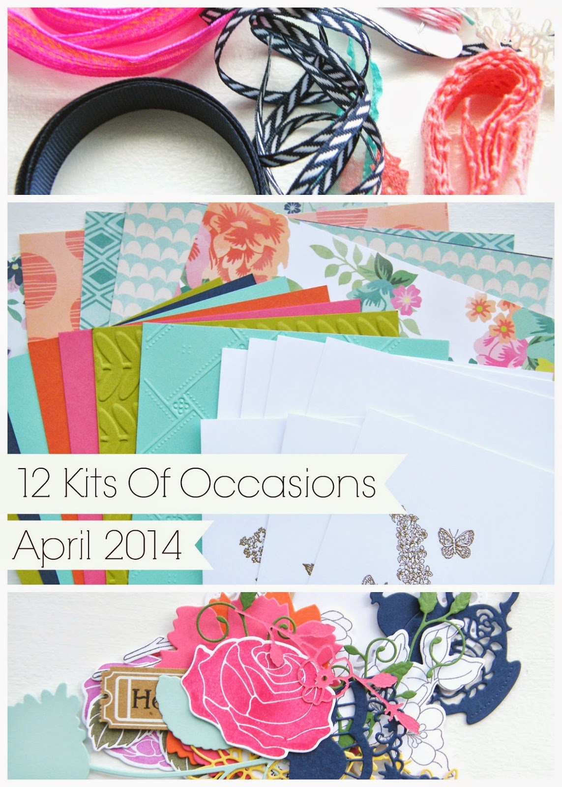
We received our beautiful spring kits from Jeanne at the beginning of the month.
Now we get to share with each other {and with you} what we have been working on.
We have 2 guest designers this month, Erin and Nancy!  Make sure to hop on over to the
 12 Kits Blog to see what everyone has made and also have a chance to win a kit for next month.
We'd love to have you join us!


I had so much fun playing around with a different style this month.
Bright colors, layers of paper, floral embellishments.....


I couldn't resist making a shaker with these cute flower sequins!


This one has got to be my favorite. 
Something about the stark black die cuts contrasted by the bright orange and yellow!
The flowers were die cut from different colored cardstock.  I covered each one with Versafine ink and then clear heat embossed them.

 
Thanks so much for stopping by!


For a full list of supplies included in the kit click {here}

Supplies used not from the kit include:
Cardstock: Clear, PTI Harvest Gold, White
Stamps: WP9 Strictly Sentiments 4
Ink: Versafine Onyx, PTI Summer Sunrise, Harvest Gold, Orange Zest
Dies: SSS Curved Die, PTI Tag Its Die
Other: Recollections Flower, Satin Ribbon, Rhinestones, Pearls

Friday Inspiration File #165

Friday, April 25, 2014

 
This was quite a week!
So many beautiful projects to see.
Have a great weekend!

Watercolor Splats

Wednesday, April 23, 2014

 
Hi!
I made a card for this week's
I added the dye ink color directly from the ink pad to a piece of white cardstock.
Then I dripped some water onto the ink.  I didn't add a ton of water because I wanted the splats to move the ink, but not become totally white.  When it was all dry I die cut the tag and hearts.
 
 
I die cut the white panel with the Simon Says Stamp curved die.  I stamped the 'clothesline' stamp from Heartfelt Mix on either side of the cut to create faux stitching lines.

 
See you again soon ;)


Cardstock: PTI White, Black
Stamps: WP9 Heartfelt Mix, Love You More, PTI Grand Ampersand
Ink: WP9 Cranberry Crush, Sweet Gelato, Sweet Nectar, Wild Mango, Versafine Onyx
Dies: WP9 Love Notes, SSS Curved Die, PTI Tag Its
Other: Clear Wink Of Stella Glitter Pen

{PURE} Color Combo #4

Tuesday, April 22, 2014

 
Hello!
I'm back from a quick trip to GA. 
It was nice to get away even though it rained almost every day.
It felt good to take a break from my craft room and even better to get back to it!
I want to share another one of my favorite PURE COLOR Dye Ink combinations.


I love these colors together. 
I think they work for either masculine or feminine cards.
 
This background set is right up my alley! 
I love the many options for stamping patterns and color combinations. 
You can get so many different looks with one set. 

 
Thanks for stopping by today!


Cardstock: PTI White
Stamps: WP9 Borders & Backgrounds 4, Hand Lettered Hello
Ink: WP9 Dye Ink Lake House, Bloomsberry, Silver Lining, Versamark Onyx
Dies: WP9 Foliage Frame

Flowers & Frames

Friday, April 18, 2014

 
Today is my final day sharing projects from the Wplus9 2014 April Release.
Next week the reins will be passed to the next DT member and you'll get to know a little more about her.  I'm looking forward to it! 
Have a Great Weekend!
 

Birthday Hellos {Friday Inspiration File}

Thursday, April 17, 2014


Good Morning!
Today I'm sharing some birthday cards on the Wplus9 Design Blog.

I have added new projects to the Friday Inspiration File early this week since I will be out all day tomorrow.  Be sure to check out The File and see what's new.....#164.
I did pin cards last week {#163}, but forgot to post a link here. 


Dear Old Dad

Wednesday, April 16, 2014

 
I'm sharing a few more projects today on the WPlus9 Design Blog.
This time with a masculine theme {not just for dads}!


{Mom's} The Word

Tuesday, April 15, 2014


Good Morning!
I have more projects to share with you today over on the WPlus9 Design Blog.
Today's projects celebrate the moms in our lives.
 

WPlus9 {Formal} Introduction

Monday, April 14, 2014


Today Dawn at WPlus9 has an introduction on her blog.
She is letting you know a little more about me and debuting my first projects as a new DT member!
She has chosen a few projects to share with you today and then the rest of the week she'll turn over the blog to me to share the rest with you.
There's a lot to share, the release was that good!
 
Stop by Dawn's blog to check out the projects and say hello!
Thank you so much to those of you have already stopped by to share your kind words and support.
Know that I am honestly equally inspired by all of you!


Colorful Landscape

Sunday, April 13, 2014

 
Hi!
I've wanted to make this card for a long time now
after seeing {this} and {this}.
 
 
I die cut a bunch of triangles.
Then I scored them down the middle and folded them.
While they were folded, I snipped off varying amounts from each triangle to create the different sizes.
 
 
Love it, don't know how I'd mail it, but I love it!

 
Thanks for stopping by today :)
 
It's so warm and beautiful today that we took a break
from laundry and tiling to take a Sunday Drive!


Cardstock: PTI Lavender Moon, Summer Sunrise, Lemon Tart, Aqua Mist, Simply Chartreuse, Spring Moss, Sweet Blush
Stamps: WP9 Quite Like You
Ink: Versafine Onyx
Dies: PTI Triangles

Wplus9 {PURE} Color Comparison

Sunday, April 13, 2014

 
Raspberry Fizz
Scarlet Jewel
 
I've said it before and I'll say it again....
I love dye inks!
These WPlus9 Pure Color Dye Inks are no exception, but I'm finding that not all dye inks are created equal. 
I have been using these colors on projects I've shared recently
 and letting you know what I like about them:
Smooth, , solid, even coverage
Deep, rich color
Stay wet long enough to heat emboss
Unique colors
I find that the colors are unique, yet work with other ink, cardstock, and
 embellishments I already have.
Many of you have commented that you think the colors are beautiful,
but wonder how they compare to the PTI inks you already have.
Do you want/need them?
The short answer is, yes!
  None are perfect matches which is great to fill in some gaps in your color collection.
 Yet, they work beautifully back to those color families
Here's a side by side with PTI inks that are in the same family.
You can see that the WPlus9 inks are deeper and more opaque which a feature I really love.
No splotchy images with these inks!
 
 
Summer Sunrise
Melon Berry

 
Ripe Avocado
Simply Chartreuse
Spring Moss
 
 
Plum Pudding
Autumn Rose

 
Lake House is my favorite color, but then again I'm partial to blue ;)
 
Enchanted Evening
Spring Rain
Aqua Mist

 
These two are the most unique. 
I didn't have anything in my stash to compare them to!
 
 
I hope this helps give you an idea if the WPlus9 inks are for you!
 
Last week Dawn introduced you to Joni Nina Andaya and shared her amazing  projects all week long using the WPlus9 April Release.
Tomorrow starts my week.
I hope you'll stop by Dawn's blog and check it out!
 
Hope you are having a wonderful weekend.
 

{PURE} Color Combo #3

Monday, April 7, 2014

 
There's a lot going on in April. 
It's also my sister-in-law's birthday next week.
She loves vintage/country style.
I thought this would be perfect for her.  It has an antique handkerchief feel to it.


Have a great day!

Cardstock: PTI White, Summer Sunrise
Stamps: WP9 Embroidered Bouquet
Ink: WP9 Appletini, Cranberry Crush, Wild Mango, Versafine Onyx
Dies: SSS Curved Edge, PTI Mat Stack Die
Other: Polka Dot Embossing Folder, PTI Twine and Buttons

{PURE} Color Combo #2

Sunday, April 6, 2014

 
Tomorrow is our close friends' son's birthday. 
He will be 8!
 
 
For his card I used another new favorite color combination that I think is perfect for boy/masculine cards.  To create the stripes I used a stencil, ink, and little daubers.
The ink when sponged onto cardstock colors completely without much work.
I have a project to share soon where it truly looks like colored cardstock, but is white cardstock colored with a PURE Color Dye Ink
At first it may appear splotchy, but as it soaks into the paper it really evens out and the dauber strokes are undetectable!
 
 
The Sweet Nectar appears a bit orange in these photos, but is actually more of a melon color.


Thanks for stopping by today.


Cardstock: WP9 Lake House, PTI White
Stamps: WP9 A Pocketful
Ink: WP9 Sweet Nectar, Nautical Navy, Lake House, Versafine Onyx
Dies: WP9 A Pocketful
Other: HS Stencil, Finger Daubers
Proudly designed by | mlekoshi playground |