Good Morning.
Time for another ColourQ!!
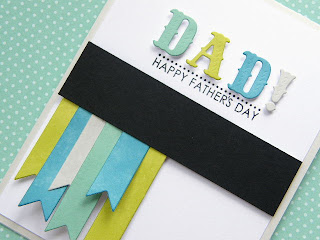
I absolutely love these colors and thought they'd be perfect for my dad.
I applied ink directly onto white cardstock from the pad itself before die cutting.
It saturated the cardstock with color and also changed the texture of the paper. It made it much softer and more pliable. I dabbed at the ink covered cardstock with a wrinkled up baby wipe. This added a subtle texture to it...almost like suede.
Thanks so much for coming by today.
I hope you'll join us this week at the ColourQ!!
Cardstock: PTI Soft Stone, White, Black
Stamps: PTI Men of Life
Ink: PTI Aqua Mist, Limeade Ice, Soft Stone, Tim Holtz Broken China, Versafine Onyx
Dies: PTI Double Ended Banner, WP9 Folk Art Alphabet


I love the colors and the banners on this are awesome!
ReplyDeleteBeautiful card! Perfect for the challenges!-Irma
ReplyDeleteLove it!
ReplyDeleteThe colors are gorgeous...
and lovin' those dyed flags...
perfect for those hard "man" cards! :)
Gorgeous as always!
This is gorgeous. I love the colors and the simplicity of it and those banners just rock! Thank you so much for playing with us over at A Blog Named Hero! :)
ReplyDeleteSweded banner flags, love them!
ReplyDeleteVery clever technique - I love the result!Thanks for playing with us at A Blog Named Hero!
ReplyDeleteSuch a super card.
ReplyDeleteOh, wow! The direct inking on the paper and die-cutting is great--I love how it looks!
ReplyDeleteOh , Kara I love this card and the colors! Off to check out the WP 9 alphabet love that!
ReplyDeleteAwesome card! Way to rock those challenges.
ReplyDeleteA wonderful card Kara! Neat technique too! :)
ReplyDeleteKara what a fantastic card for Dad, your colours look just amazing! You are rocking all these fun new techniques!
ReplyDeleteLove the way you inked the papers - gorgeous color combination!
ReplyDeleteI love these letters!!! And the banners! What a cool technique to ink the paper, too!
ReplyDeleteFABULOUS Father's Day card, Kara! Love this color scheme and the design of your flags :)
ReplyDeleteYour dad will love this Kara, I know I do! Love the colored letters ;)
ReplyDeleteGreat technique with the paper & dyes! Love the colors and your layout with the dark strip in the middle!
ReplyDeleteAwesome choice of design and color for these two challenges. I love the soft look of your banner die cuts. Great photos too, btw!
ReplyDeleteI LOVE this. I will be borrowing this idea!
ReplyDeleteOh, what a fabulous card, Kara! I love the design and your layered flags!
ReplyDeletewow!!! i saw this card on the a blog named hero challenge and i just had to tell you how stunning it is!!! LOVE the colors and the banners and the CAS feel you created!! it's a brilliant card!! amazing!
ReplyDeletewonderful card and great use of the colors
ReplyDeleteBeautiful color combo. I love your hand died flags. The black strip of card stock just sets everything off perfectly!
ReplyDeleteGreat card Kara, love the color combo!!
ReplyDeleteAbsolutely FABULOUS card!!! I love the colors and the design. Those flags are just too fun! Thanks so much for playing with us over at A Blog Named Hero!!
ReplyDelete